Shopify remains a popular choice for Australian businesses, and for good reason. It’s secure and reliable for small businesses, easy to set up and manage, showcases your business online, and communicates the order process with customers. However, one of the common drawbacks of Shopify email templates is the lack of customisation.
Within Shopify, you can make basic customisations to your templates, like adding your logo and choosing the colour theme. But when it comes to major styling changes, there’s not a lot you can do without having an understanding of HMTL and CSS.
Integrating Shopify with your email marketing software gives you the ability to create email templates from scratch – no coding required! So we’ll be touching on key customisations to help optimise your communications and generate more Shopify sales for your business.
Why customise your Shopify emails?
Whether you’re notifying customers about order details, abandoned checkouts, or customer accounts, there is a lot of scope to improve your email communications. From a design perspective, customising your emails will let you create a more consistent look and feel with your branding. Consistency also helps to build authority, brand recall, and can even lead to an increase in revenue by 33%.
Customising your templates gives you the chance to include value-add content, like highlighting recommended products, sharing onboarding information or product instructions. To help boost sales you can also include promotions or incentives – like discounts, special offers, or time-sensitive sales. Here’s just a couple of ways you can unlock the full potential of your Shopify emails.
1. Stay on-brand with design
Customising your Shopify templates to be on-brand will help to maintain consistency across all of your customer touchpoints. Embedding on-brand images, personalising your email wording, and keeping your tone of voice consistent is just the beginning. You will have the ability to change up the styling, layout and even the padding around different email elements. Creating on-brand templates for your Shopify emails will give your customers a smooth and more well-rounded shopping experience.
Burst’s vibrant branding is a focal point in this shipping confirmation email, with its bright colours and illustrations highlighting important calls to action throughout the email.

The Sunday Collective use their abandoned cart email to give potential customers a taste of their personality. They use on-brand colours and simple messaging to communicate their company ethos, highlighting what they believe in and their ethical USP’s.

Need some email template design ideas? Take a look at our email inspiration page.
2. Add incentives to abandoned checkout emails
Recovering abandoned carts is important for Shopify users, along with eCommerce businesses across the globe. Including incentives is one of the most effective ways to appeal to hesitant customers that may be price-conscious. For more than half of online shoppers, free delivery is one of the most convincing incentives to encourage a purchase, followed by coupons and discounts.
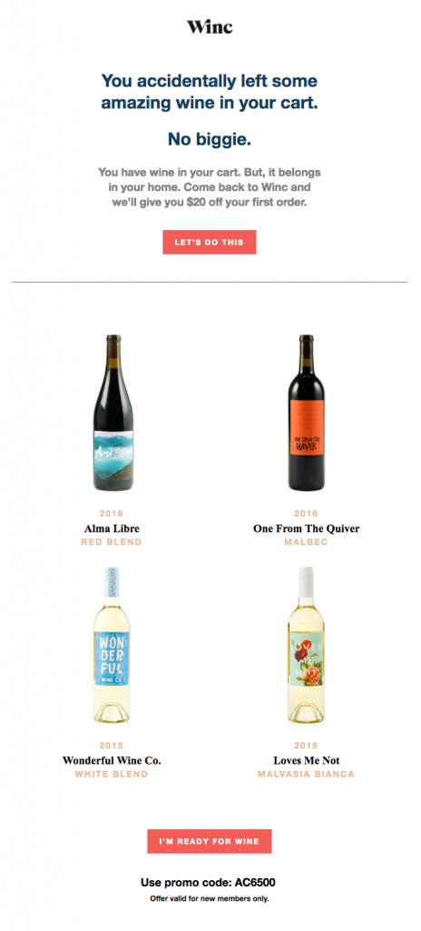
Winc entices customers to complete their wine purchase with a discount on their first order. By leading with the incentive it helps guide customers down to the all-important CTA.

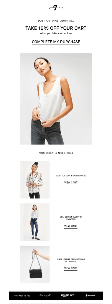
7 FOR ALL MANKIND use the same thinking in their email, leading with their discount offer to get readers attention. By including multiple calls to action, they make it easy for customers to engage at any point in the email.

3. Add value to welcome emails
Welcome emails are your chance to make a great first impression, and one of the best ways you can do this is by providing content that adds value for your customers, beyond the generic “Thanks for becoming a customer!”.
Value-add content can look like: account set-up information, additional resources, instructions or how-to guides, or access to gated content.
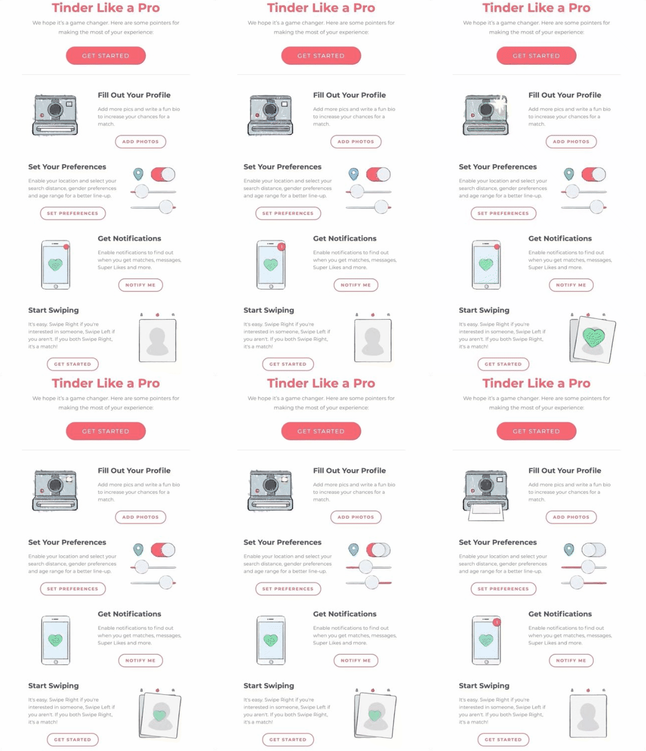
Tinder’s welcome email includes clear steps and tips for starting a new account, laying out how easy it is for users to set up and use their platform. The addition of the GIF imagery not only makes the email eye-catching but also helps to explain the Tinder interface to newcomers.

Glossier uses its welcome email to share additional content like product insights, contact information, and customer testimonials to help inspire customers and create a brand community. The simple design and high-quality imagery help to set the tone and highlights the most important sections and CTAs.

4. Include recommended products
Without being pushy or spammy, you can promote new stock, best sellers, highlight accompanying products, or even promote a sale. Curating a personalised ‘recommended products’ list will increase your chances of generating more sales, as it speaks directly to your customer’s interest. Research has shown that online retail browsers who engaged with a recommended product had a 70% higher conversion rate.
Grove Collaborative uses its abandoned cart email to highlight recommended products that are specific to the customer’s shopping habits and preferences. The use of a simple, on-brand design gives the products and call-to-actions centre stage.

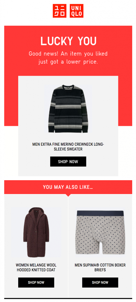
Instead of a long list of products, Uniqlo keeps it short and sweet by highlighting a few select items. They lead with an item that the customer has shown interest in, incentivise the purchase by reducing the price, and then recommend related products that are likely to pique the customer’s interest.

5. Highlight your unique selling proposition
Calling attention to your USP is a compelling sales tactic and a great way to reinforce brand trust and authority. In our eCommerce email template, the ‘Our Features’ section allows you to succinctly highlight reasons why customers should convert, while also including a section for testimonials to drive social proof.

Create your very own customised email templates for Shopify by integrating your Shopify and Vision6 accounts via Zapier. Don’t have an account yet? Sign up for a free trial today!


