While you may not think much of your plain jane email newsletter, there’s much more to them than meets the eye. Pushing out consistent newsletters not only keep your brand top-of-mind but they help build trust and authority with your subscribers. If done right, your email newsletters have the potential to be a crucial touchpoint that guides your quality leads back to your doorstep. But breathing a new meaning and life into your newsletter doesn’t have to be stressful. So we’re going to unpack all the crucial elements so you can learn the art behind writing a great email newsletter that your subscribers believe is worth sacrificing their inbox space for.
Give Your Email Newsletter Personality
Be humorous, but don’t force your jokes. Sound conversational but not unprofessional. Be philosophical but not too serious. Are you feeling overwhelmed yet? Well don’t worry, you can throw that rule book out the window because there’s no ‘one size fits all’ when it comes to your tone of voice. It’s something that should be unique to your brand, so when your email hits your subscribers’ inbox they immediately know it’s you by your (written) voice.
You want your emails to take on their own personality. So to help set you on the right track of discovery here are some examples of different tones that might suit your brand:
- Philosophical – Rather than appeal to emotions appeal to the mind. You’ve got the power of knowledge so use it to your advantage. Open the floor up to questions and give your subscribers a thought to ponder.
- Charismatic – Draw your subscribers in with your unique quirky charm. Injecting humour into your tone shows your subscribers that your brand is run by real, down-to-earth humans that don’t take themselves too seriously.
- Straightforward – If you like to keep it simple then opting for focused and punchy tone can be a powerful technique to help drive your message home. It’s important to keep your messaging clean of wishy-washy language that may look like waffling.
- Down-to-earth – Essentially you’re selling yourself as approachable, so you want to treat your subscribers as equals. Be open and honest by giving it to them straight. So avoid fancy industry lingo or flowery words that will kill your friendship vibe.
- Cheeky – There’s nothing boring about reading emails that are brash, quick-witted and at times provocative. But this type of tone of voice can be quite risque so it takes creativity to make it work and make it palatable for your audience. You want to be funny, but you also don’t want to damage your reputation.
Dress for the Season
Time to whip out the calendar and mark all the important dates, because your holiday seasons provide the perfect excuse to dive into the costume box and dress your emails to impress. Surprise and delight your audience with an email series that will ignite the holiday spirit and get those early-bird shoppers flocking to your site. The secret behind all great holiday campaigns buries down to planning. So don’t leave it till the eleventh hour. Make sure you’re allowing at least 2 months to start planning your to-do list.
Here’s some important dates as well as some “non-official” holidays you can start circling in your editorial calendar:
- Australia Day – 26th January
- Valentines Day – 14th February
- Easter (Good Friday, Holy Saturday, Easter Sunday, Easter Monday) – April
- Halloween 31st October
- Christmas 25th December
- News Years 1st January
- Black Friday/Cyber Monday – November
- ANZAC Day – 25th April
- Boxing Day Holiday – 26th December
- Back to School – Late January
- April Fool’s Day – 1st April
- End of Financial Year – 30th June
- Mother’s Day – May
- Father’s Day – March
- International Day of Peace – 21st September
- International Friends Day – 30th July
Check out our blog If you’re looking for more email marketing ideas to inspire your holiday campaigns.
Ask Yourself if it’s Time for an Email Makeover
The biggest risk you face is not taking any risks at all, so get your head in the game and start experimenting. Time to make your newsletters sexy again.
In saying this, you don’t want your subscribers breaking a mental sweat trying to read your emails. If you’re using overstimulating images or outrageous colour contrasts that make your emails look like they’ve consumed about 10 cups of coffee, then expect a crash landing as soon as they hit your subscriber’s inbox. Your design elements should be there to compliment your content not distract the reader from what’s important.
Here are simple hacks to give your email newsletter that cutting edge:
- Give your subscribers an interactive experience. Try incorporating video, animated GIFs, adding hover effects, games, or quizzes.
- Email newsletters tend to be very content heavy so take advantage of your whitespace by using your spacers in your template builder. Break up your copy by building with more of your text and image layout blocks or try using an infographic to let your data tell a story.
- Sometimes even the simplest of changes like adding a background image to your email or an emoji in your subject lines can be a welcome surprise to your subscribers.
- Make your content snackable by placing text and associated images in a zig-zag pattern. If your newsletter is very image-heavy, using an inverted pyramid layout will invite your readers to scroll.
- If you want your subscribers to see your work of art, make it readable and accessible. So that means keeping your CTA buttons between 45-50 pixels tall, sticking to web-safe fonts, using text left-aligned, optimising for dark mode, and always creating a plain text alternative!
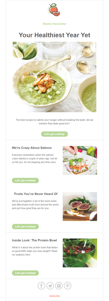
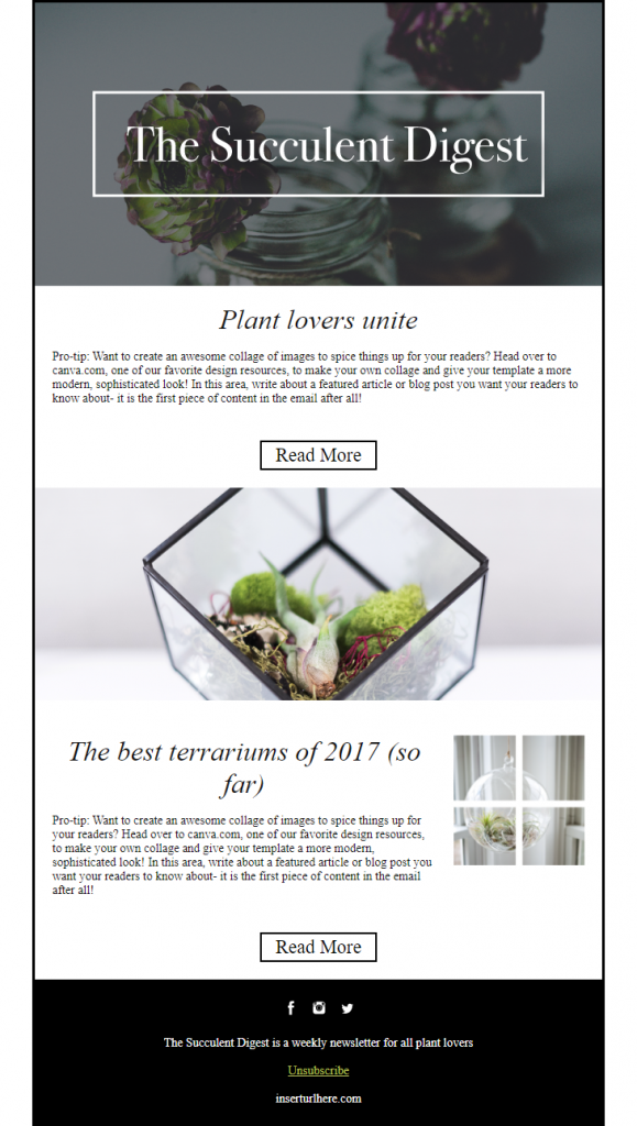
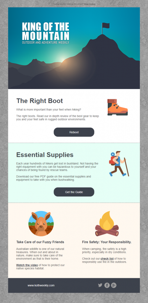
If you fall into the pool of fast and loose players who love a good email template to make life easier, then check out Vision6’s premade design templates available to edit in your free trial account. Here’s a few of our newsletter templates we’re confident you’ll love:
The Wanderer, Template 1

Your Healthiest Year Yet, Template 2

The Succulent Digest, Template 3

King of the Mountain, Template 4

Make Your Newsletter Valuable
As a general statement, we say stick to the 90/10 rule: keep content 90% educational, 10% promotional. But, don’t overwhelm your readers with a scrambling of blogs, industry news, product updates and upcoming events all in the one email. All too often we see newsletters used as a dumping grounds for pre-published content that’s often thrown together at the last minute to meet pressing deadlines. Try keeping them short and sweet, honing in on one particular topic that will be valuable to your audience.
Struggling from writer’s block? We’ve got the perfect cure to get your creative juices flowing. Research topics that are receiving a lot of screen time by using Google Trends or social listening tools like Awario. Report on a topic you feel is relevant to your brand or your industry.
You could also try just sending out fun emails that are purely interactive with no sales-sy content. Facilitating positive experiences like this, leave your subscribers hanging on the edge of their seats for your next email newsletter.
Let Your Subscriber’s Choose
We know it’s not your intention to drive your subscribers away but unfortunately we can’t always please everyone…or can you? This is where your email preference centers and customer surveys come into play. Don’t wait until your subscribers want to break up with you, delight them with preferences from the get-go. Not only does implementing a preference center allow for unique personalisation but you can gain valuable data, like which one of your content pillars is more favourable in the eyes of your consumers.
But who has the time to create and populate separate lists for each survey? We sure don’t! Vision6 makes it super easy to run as many surveys as you want without additional software, it’s all on the one platform! Your customer responses are automatically collated and easy to export so you can gain deeper insights about your subscribers and use it to wow them later. See how you can do it in Vision6 in less than 10 steps!


