Planning an event can be stressful. There are heaps of moving parts and important deadlines, but none of that matters if people don’t turn up.
Your invitation email is one way you can notify people about your event and get them to register their interest. However, if your email doesn’t appeal to them, it can turn them off your event immediately. You need to put your best foot forward, but how?
Take a look at these 6 design inspirations for event email invitations that will show you what to include and why.
1. Use eye-catching design
Good design is engaging and helps set the tone for your event. The imagery should be on-brand and consistent across all marketing collateral. This will build familiarity and awareness of your event branding, as well as rousing interest.
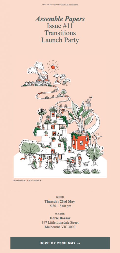
Assemble Papers launch party invitation sets itself apart from other emails in the inbox. It is beautifully designed and the distinctive illustration gives it a unique flair. The only issue with using complex imagery like this is that it won’t always render on the receiver’s end. Assemble Papers helps to mitigate this by including an all-important web browser version to ensure people can view the email how it was intended.
2. Lead with key information
Whether your event is online or in person, there are important details that attendees need to know straight away. You don’t want an invite email that leaves your subscribers hanging. Might sound obvious, but think about highlighting key information like date, time, location and where subscribers can register or purchase a ticket.
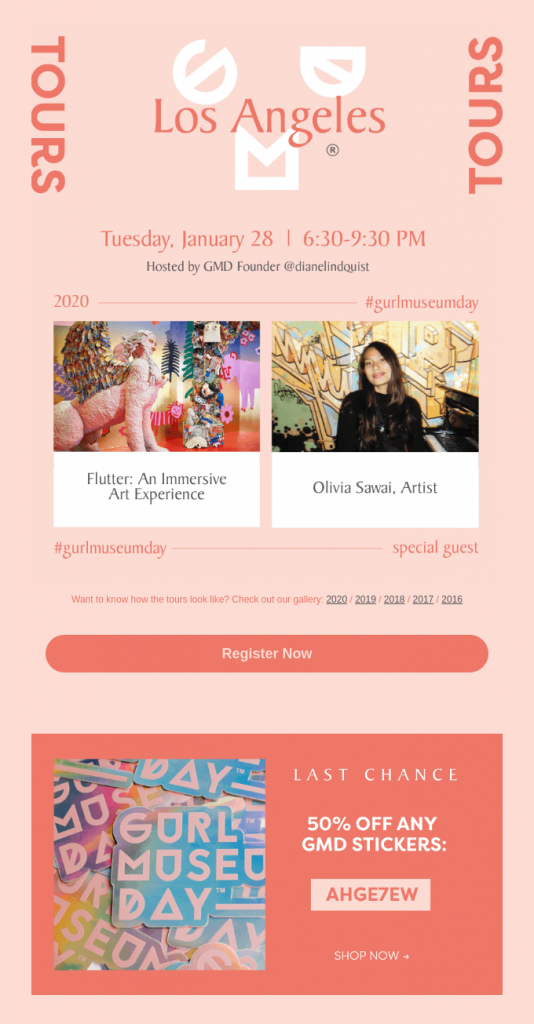
Consider positioning it at the top of your email like GURL Museum Day’s invite, so that people see it immediately. You can then follow with additional information like event agenda, speaker lineup and perks of attending. This helps sell the reasons why subscribers should attend your event.
3. Highlight what attendees get out of the event
Stylist Live’s invitation highlights the benefits of the event, namely the things that attendees can learn from the programme. Including this in the invitation email will not only give people information about the event speakers and agenda, but it gives them a taste of what’s in store.
You could share keynote speaker bios, programme highlights, stall information, workshops, or additional features people can expect. If you’re sharing information about your speakers, it also helps to add a face to the name, particularly if they are a drawcard.
Even if the event is free, you need to appeal to your target audience and sell your event like you would your products or services.

4. Use incentives
As well as highlighting the benefits, you can boost registrations and ticket sales by offering an incentive. While you hope that your event will be enough to entice attendees, sometimes your subscribers need a little push.
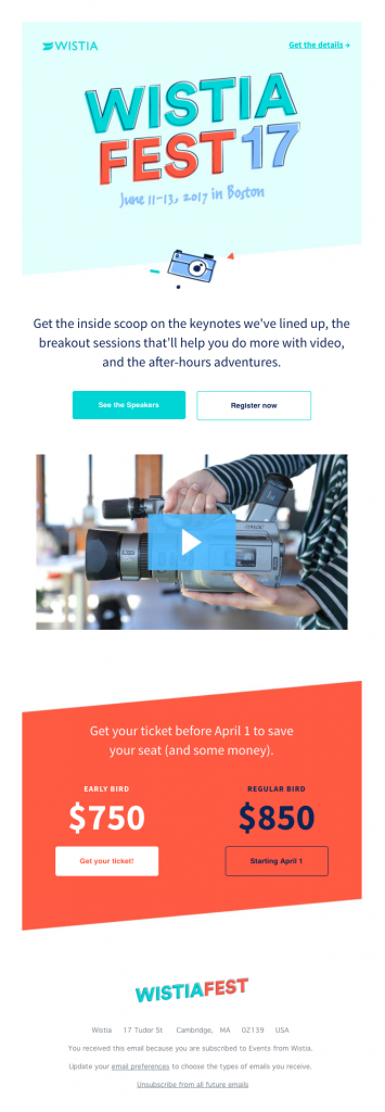
There are plenty of ways you can convince your subscribers to attend your event, including discounts on early bird tickets, lucky door prizes, giveaways, affiliate product discounts, or VIP access. Wistia’s invite email makes sure their incentive is prominently displayed, clearly showing subscribers the money they will save if they act now.
5. Clearly show how and when to register
If you want to make sure the path to purchase (or registration) is as simple and straightforward as possible, it all comes down to your all-important CTA. Your call to action is one of the most important elements of your email template. This will be where invitees can take the desired action, whether that’s registering for the event or purchasing tickets. Like all CTA’s, this needs to be prominent and clearly communicated.
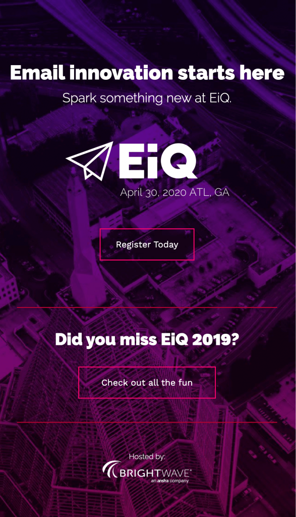
BrightWave’s email uses simple and concise messaging to avoid confusion or overwhelming them with too much information.
6. Follow up with reminders
No matter how successful your invitation email may be, there will be invitees that don’t take action straight away or forget to respond to the invitation. This is where reminders come in. In the lead up to your event, you can send out reminders to invitees that haven’t responded yet, but make sure you segment them into a new list — you don’t want to send reminders to people who have already registered!
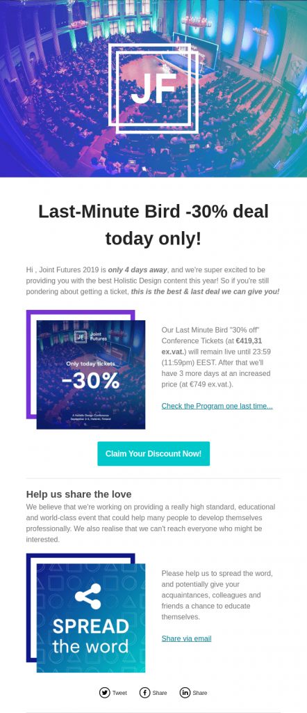
Like Joint Futures’ email, you can entice people to register by adding a deadline to your incentive. Using scarcity is an effective tool; if something isn’t available anymore, it becomes more attractive. You can also try sending multiple reminders in the lead up to the event, just make sure you don’t spam them with too many.
Looking for more email template design ideas? Take a look at our template library of real-life email designs.
Want to learn how we did it? Take a look at how we got more attendees to our 2020 EMSA event.


