So, your email campaign is finally ready. It’s looking mighty fine and well-prepped to charm its way into your subscribers’ hearts. You hit send…but before you can breathe a sigh of relief, you realise your worst fears have come true! Your once beautiful email looks like a jumbled mess of foreign fonts, GIF glitches, blocked images and rivers of whitespace.
Yes, we’ve all been there. Unfortunately, your emails don’t always look the way you intended when they land in your customers’ inboxes. Considering there are at least 2.2 billion people worldwide who are visually impaired, you can guarantee a significant portion of that figure are email users. While you may think your fresh layout, fancy fonts and vibrant colours work well for your email campaigns, you may actually be neglecting a proportion of your subscriber base that may be visually impaired or use screen readers.
So what is the secret to creating beautiful email campaigns that are readable and accessible to all your valuable subscribers? Well here’s our hot tips for email accessibility best practices so you can keep your emails looking like a 10/10.
Embrace the dark side
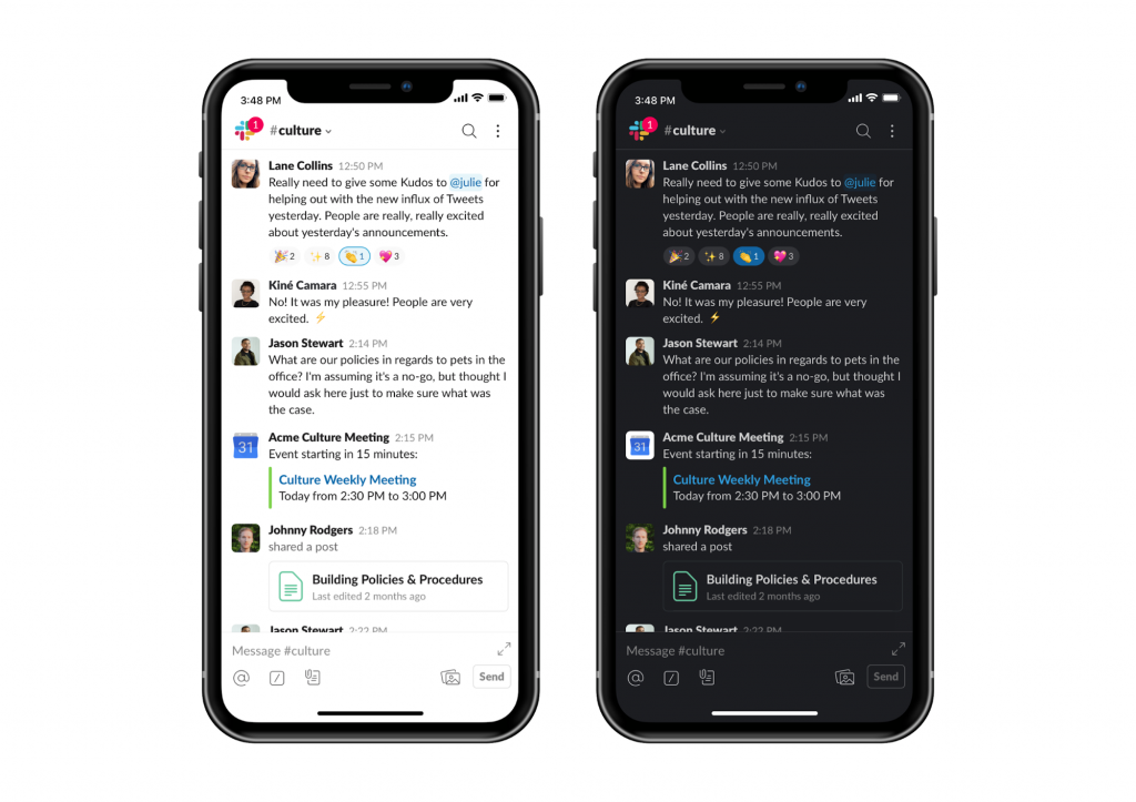
Screens everywhere are shifting to the dark side, as this UI trend is taking over your subscribers’ inboxes. Introducing the new “Dark Mode” interface, improving readability, easy on the eyes and saving your battery life..what’s not to love? But I’m not here to convince you to make the switch, instead, I’m going to explain why you need to start optimising your emails for both light and dark display preferences.

Luckily most email servers automatically render your light mode by default. Meaning your emails will stay the same regardless of your subscribers previewing in light or dark mode. So you may be thinking, meh why bother changing anything? But continuing to throw a bunch of outrageously colourful images and vibrant text in your emails, will be a very dizzying experience for eyes that are used to a dark soothing environment. Here’s a couple of hassle-free ways you can cater to those who prefer the “dark mode” experience.
- Use a dark mode preferred colour scheme for your background, images, font and even your CTA buttons.
- Go easy on the eyes and opt for a font colour that is a light or dark shade of grey when using a black or white background.
- Keep it consistent by using transparent images or .pngs to avoid unwanted background colours around your images or buttons.
- Evaluate your accessibility by testing your text-background colour combinations. Try using Contrast Checker to see if your current colour combo meets Web Content Accessibility Guidelines (WCAG).
Optimise your headings
Wrap these beauties up in some <h1> <h2> tags, don’t rely purely on style elements (bold, colour, underline). By using HTML tags you will help establish a text hierarchy that will be easy to follow for your screen readers or subscribers using other assisted devices.
Always create a plain-text alternative
When sending out your email campaigns a plain-text message is crucial! Not only do spam filters highly regard emails with a plain text alternative, but your visually impaired readers prefer them too because they are simple and carry the core content of your message.
If you’re using Vision6, plain-text emails are automatically generated and are easy to edit, so you can tailor the perfect message for your valued screen readers.
Choose your images wisely
Oh, look at you…you’ve dressed up your email with some cool interactive content. But before you start flaunting this new trend, you should know there are some drawbacks. Some of your subscribers may be using old-timers like Outlook 2007, 2010 or 2013 and unfortunately, these email servers don’t let your customers view your super cool GIFs. I know, how rude! Instead, these email servers default to the first frame. So if you’re using GIFs that include your CTA or special offer, make sure it’s displayed on the first frame.
It’s also important to make sure your GIFs are making smooth transitions. If you’re switching from frame to frame too quickly you’re going to give your subscribers (especially those who struggle to read) an eye headache.
Subscribers may also be unintentionally blocking images by default. So attributing the appropriate alternative text for informative images is crucial if you want your subscribers, in particular, screen readers to know this image is worth a click.
The bigger, the better
The rumours are true…people really do like big buttons! With mobile becoming an increasingly popular device to view emails, it’s so important that your CTA buttons are finger-friendly. Who’s got time to zoom in on emails to read the tiny text and make the buttons a decent clickable size. Email marketing best practice says that your average CTA button should be anywhere between 45 pixels and 50 pixels tall.
Don’t go crazy with your fonts
Similar to your colour scheme you should really only be using one or two fonts. If you feel like your email looks a little dull, spruce it up with BOLD or italics. Make sure when you’re choosing fonts, they are supported across all email browsers. Because if they aren’t, your receiving servers may substitute a default font which may be hard to read or completely off-brand. We recommend sticking to web-safe fonts or pre-selecting your own fallback font.
Give your email some breathing space
Don’t crowd your text, images, and buttons, give them space to breathe! Ideally, separate your text with paragraphs and line spacing. Adding white space around your key email elements will help separate them visually, making your call to action buttons stand out.
To increase email readability, using left-aligned text is the way to go. Your inner OCD may be telling you to centre all your body text in emails. But without a straight left edge, you are actually forcing your readers to work harder to find their place each time. Centred text is best used for headings or short sentences that are easily scannable.

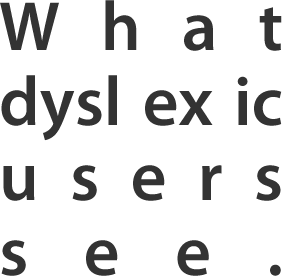
Another big no-no is using justified text. This is a popular typographic alignment for print media, NOT email! The rivers of whitespace in the justified text not only disrupts reading flow but your emails become barely readable for dyslexic users.

Test, don’t guess!
Now all the hard work is done, it’s time to test! And by test, we don’t mean one and done. Preview your email accessibility across different devices and different email servers. Go that extra mile and use a/b split testing to see what CTAs, colours, fonts, and images are most responsive with your subscribers.
Don’t fall victim to the email send anxiety. Start hitting send with confidence by adding these simple steps to your next email campaign checklist.


