Yet another year flies by with interactivity continuing to be the talk of the town in the email and content marketing space. And as more big players begin to incorporate interactive experiences into email, the more your subscribers will see this trend as an expectation rather than a novelty.
Here’s just a few reasons why interactivity is an important consideration for your email campaign strategy:
- It simplifies the user experience
- Creates curiosity beyond a base level
- Increases engagement and conversion rates
- Allows you to say more with less
But the question remains: ‘How the fudge do I create interactive emails?’. Buckle yourself in because we’re going to help you navigate your way through the interactive world by running through the basic to the more complex kinetic email designs.
Video/GIFs
We know for a fact that GIFs and video not only improve email KPIs but create brand memorability. While we may have come a long way in terms of using video in emails, there are still a few well-known email clients like Gmail, Outlook and Thunderbird that don’t support the technical requirements needed to play a video within an email. We also know it can be quite a fiddly process to embed videos into your emails. To save you time, use our video component which has a two-step workflow – just simply drag-and-drop the module and add your link! The video thumbnail image and play button are automatically created for you.
However, If you want to up the ante and create the illusion of movement in your emails, we have a few tricks up our sleeve that don’t involve speaking in code.
- Convert your video into a GIF – There are many free online tools to convert your videos into GIFs however we recommend using photoshop if you want to maintain quality. All you need to do is add a static play button overlay to your GIF like the example below.
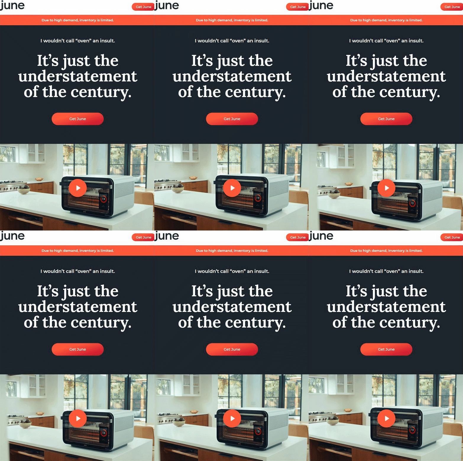
- Use an animated play button – Essentially you’re just doing the same thing as above except using an animated play button overlay to a static image of your video. Although a small animation, this strategy is just as effective at creating intrigue beyond a base level.
Video is a great way to drive subscribers to your YouTube page where they can explore and binge your feed. And by using GIFs for your videos you can create memorable interactions that static images alone can’t produce.
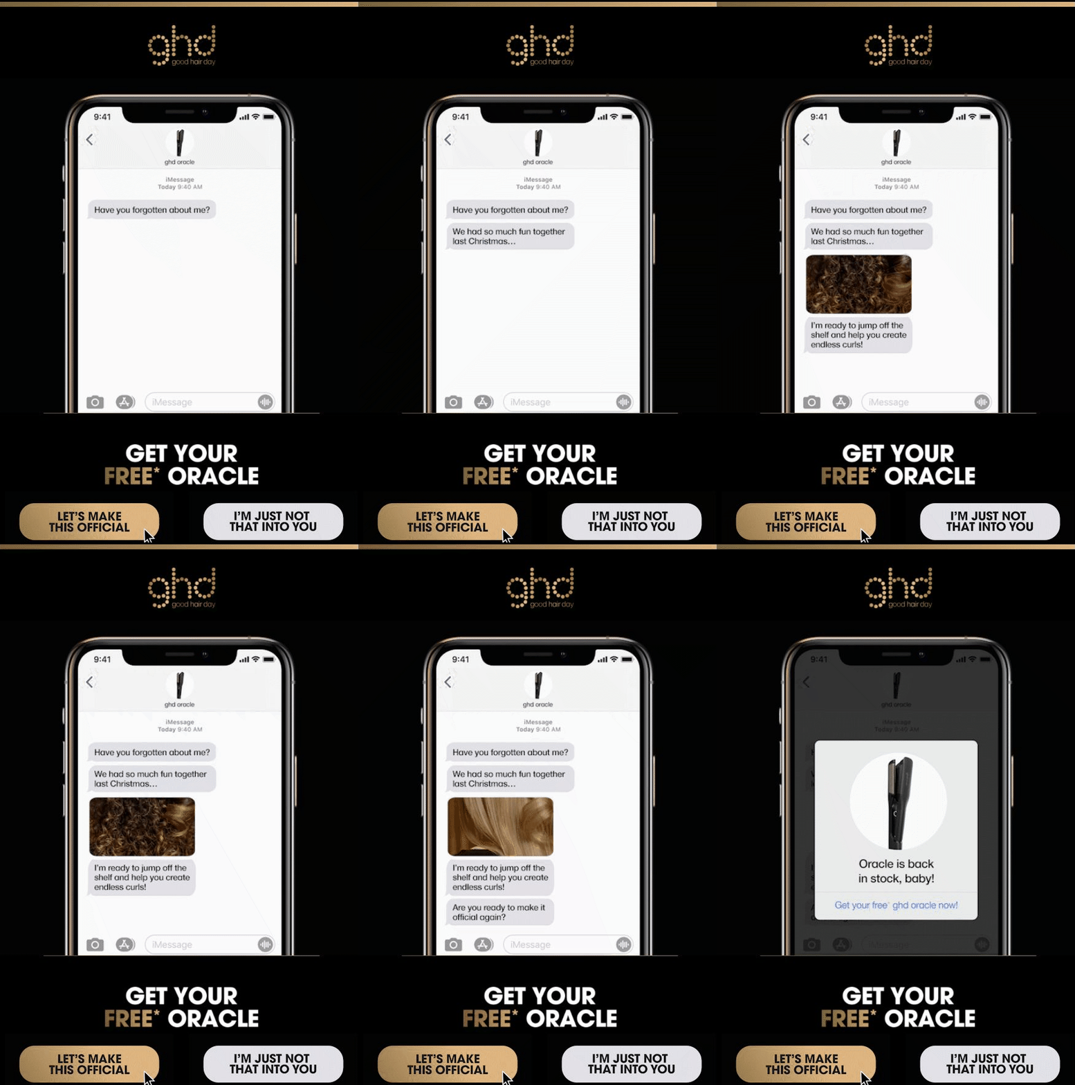
Here’s an example of what ghd hair cooked up in Vision6:
Countdown Timers
Countdown timers are designed to create a sense of urgency and give your readers the wake-up call they need to spring them into action. While it isn’t exactly an interactive element, the live count-down timer does an exceptional job at communicating the limited-time status and building anticipation. If you’re looking for a platform to create countdown timers check out Nifty Images. You can easily customise your own timer to your branding then copy the HTML code over to the text component in your Vision6 template builder.
Quizzes / Surveys / Polls
Want to create an experience that is a win-win for both you and your subscribers? Breathe new life into your newsletters, promo or even transactional emails by using quizzes, surveys or polls to encourage your subscribers to interact with your brand.
You can use our built-in survey forms to create fun, memorable interactions with your subscribers all while providing you with valuable audience insights. For a smoother and seamless user experience, you can try your hand at embedding your survey inside the email. But be warned, this design technique can be a challenge to build for an inexperienced coder such as myself.
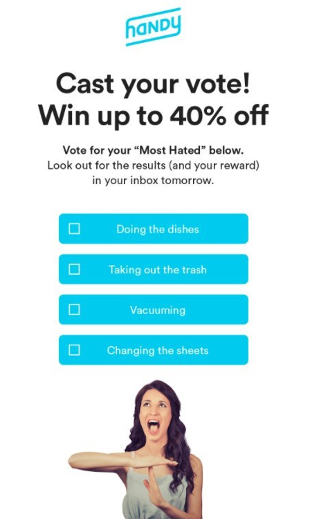
Here’s an easy way around this hurdle: the example from Handy below creates the illusion of poll-based interactivity by simply using multiple images or CTA buttons to track subscribers’ clicks (you can easily do this with our drag-and-drop editor and reporting tools).
Hover-based Interactivity
Hover effects take your emails to a whole new level by combining the use of HTML or CSS. If you’re a newcomer to the email developer scene, hover-based interactivity is a great place to start. Adding hover effects over your text links, images or buttons, immediately tells your subscribers the link is clickable. It also adds a fun interactive element that makes your call to action more enticing to click.
Hover effects are best used for:
- Teasing your subscribers – Don’t reveal all your cards right away, keep your subscribers guessing. Hover and roll-over effects allow you to create experiences that require your subscribers to interact with your email in order to uncover a promo code, special offer or the latest product.
- Decluttering your emails – Don’t pollute your emails by trying to cram all your information on one page. Use the hover effect to hide product information, descriptions, price etc.
You can easily code HTML directly into Vision6 or upload your custom coded HTML email templates with the drag and drop editor. Just save your email as a template so you can access it and use it whenever you want.
WARNING! We are about to dive into the deep end of the pool. So before you keep scrolling you should know this content may become overwhelming if you have little experience in the world of code. If you don’t know much about HTML or CSS code then these email tricks are best left in the hands of your internal email developer or outsourced to one.
Navigation
With mobile set to overtake desktop, we’ve started to see more brands moving towards creating a fully interactive app-like experience in email. This technique does require a more sophisticated knowledge of email infrastructure. So while it does not come without its challenges, there are still many advantages to investing in a web-like design, for example:
- You can familiarise your subscribers with your website layout. This consistency allows for a smoother transition from email to landing page.
- Navigation also allows the experience to be a user initiated exploration.
- The improved UX and UI gives users an easier and frictionless experience.
- You can declutter your emails and help keep them short and sweet leaving it up to your subscribers to locate the information they want to consume.
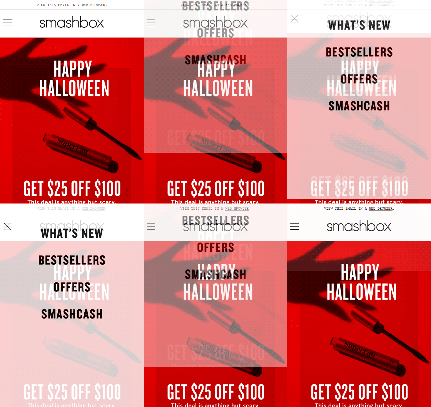
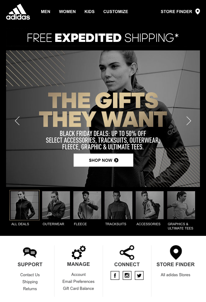
The examples below demonstrate how you can transform the traditional scrolling of an email into an interactive navigation:
Drop-down menu
Don’t tire your subscribers with endless scrolling when you can save space and keep all your important email elements “above the fold” by adding a drop-down or hamburger menu.
Carousels and accordions
By using a carousel you can display multiple images in a neat fashion without cramming them all into one lengthy email which will slow your load time. Some email clients don’t support this type of interactivity so you need to make sure that your design automatically renders with the images stacked on top of each other.
Games
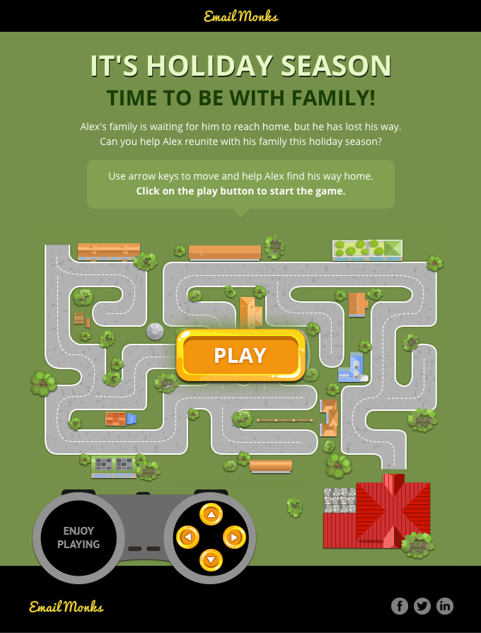
Gamification is a great way to throw some fun into your emails and embrace your interactive flair. If customers feel good about the content you’re serving up then you’re already on the right path of moving from purely transactional to building a solid relationship.
Surprise your email subscribers once in a while with interactive games and experiences that are void of sale-sy content like the example below. Creating engaging content that adds value will not only leave a lasting impression, but will also get your subscribers excited to receive your next email.
In-Email Browsing or Shopping
Emails behaving like websites— once a dream, now a reality. If you want to truly push the boundaries in terms of email interactivity, transform your email into a mailable microsite with in-email browsing and/or shopping. It may not be widely used due to the complexity of the design, however, as more subscribers become attuned to the web-like UX/UI design in email we will start to see this trend emerge from the deep end. Ultimately the goal is to bring the landing page to the inbox, creating a more seamless journey that will help eliminate drop-offs.
But before you throw all your budget into creating interactivity, test your emails! Our a/b testing feature is a great place to start if you want to assess the performance of your email marketing campaigns. Unfortunately, many inconsistencies still exist between email servers and their mobile versions. With Vision6, you can conduct Litmus inbox testing which allows you to preview options across a variety of different email clients and devices to make sure your interactive email is looking as beautiful as you intended.


